app / web · responsive web design
scroll
AI Beauty platform
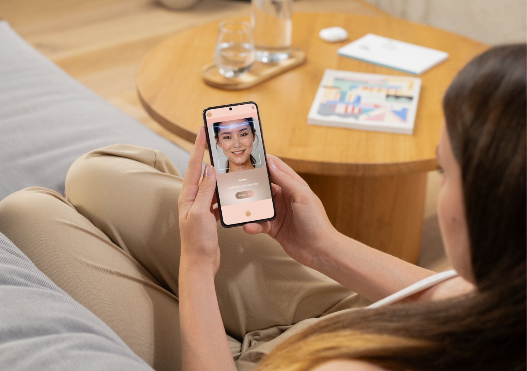
A responsive website that allows visitors to instantly try out AI skin analysis — without downloading an app or registering for an account.
A responsive website that allows visitors to instantly try out AI skin analysis — without downloading an app or registering for an account.
the beginning
This project set out to help a new startup build its website. It began with a single, demanding brief: an investor-accessible prototype needed to be ready within four weeks. We discussed accessibility for users on both phones and computers, and ultimately decided on a responsive website — one that lets visitors instantly try the core feature without downloading an app or registering for an account.
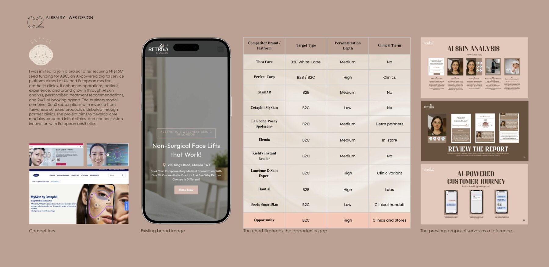
I was invited to join after the client secured NT$15M seed funding for an AI-powered digital service platform aimed at UK and European medical-aesthetic clinics. It enhances operations, patient experience and brand growth through AI skin analysis, personalised treatment recommendations and 24/7 AI booking agents. The business model combines SaaS subscriptions with revenue from Taiwanese skincare products distributed through partner clinics — connecting Asian innovation with European aesthetics.
research
A competitor analysis across ten AI skin-analysis platforms — from B2B white-labels such as Thea Care and Haut.ai to consumer experiences like La Roche-Posay Spotscan+ and Lancôme E-Skin Expert — revealed a clear gap in the market: a B2C experience with high personalisation depth, tied directly into clinics and stores. The client's existing brand image and previous proposal set the reference point for where the new design had to take the brand.
foundations
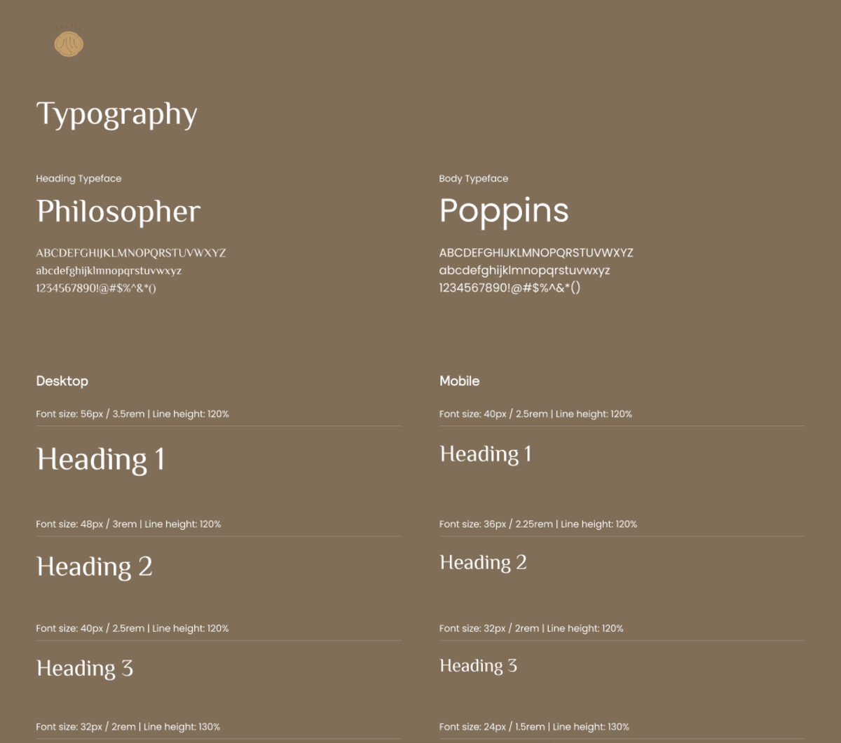
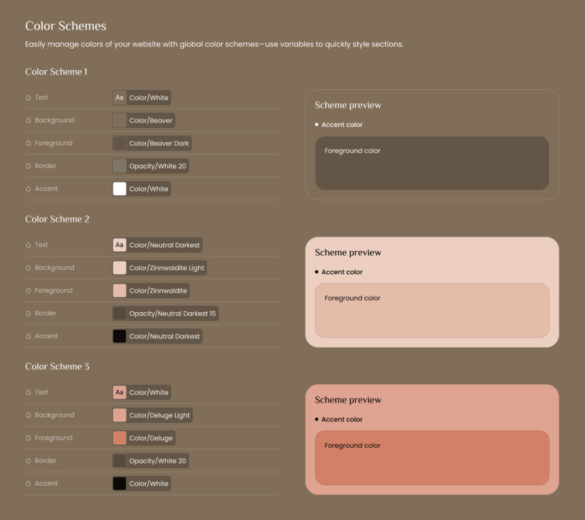
Before designing a single screen, I set up a lightweight design system so the prototype could scale quickly and stay consistent. It pairs an editorial display face, Philosopher, with the highly legible Poppins for body copy, and defines three interchangeable colour schemes — a warm beaver, a soft blush and a terracotta accent — managed as global variables so entire sections could be restyled in a click.
process
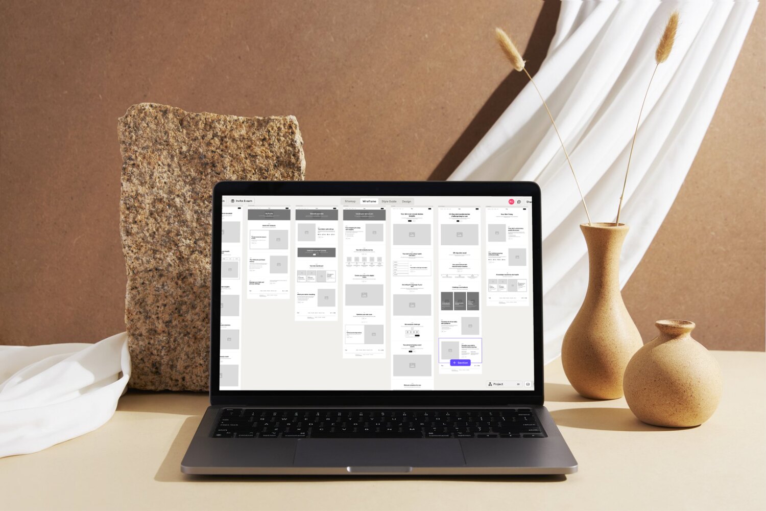
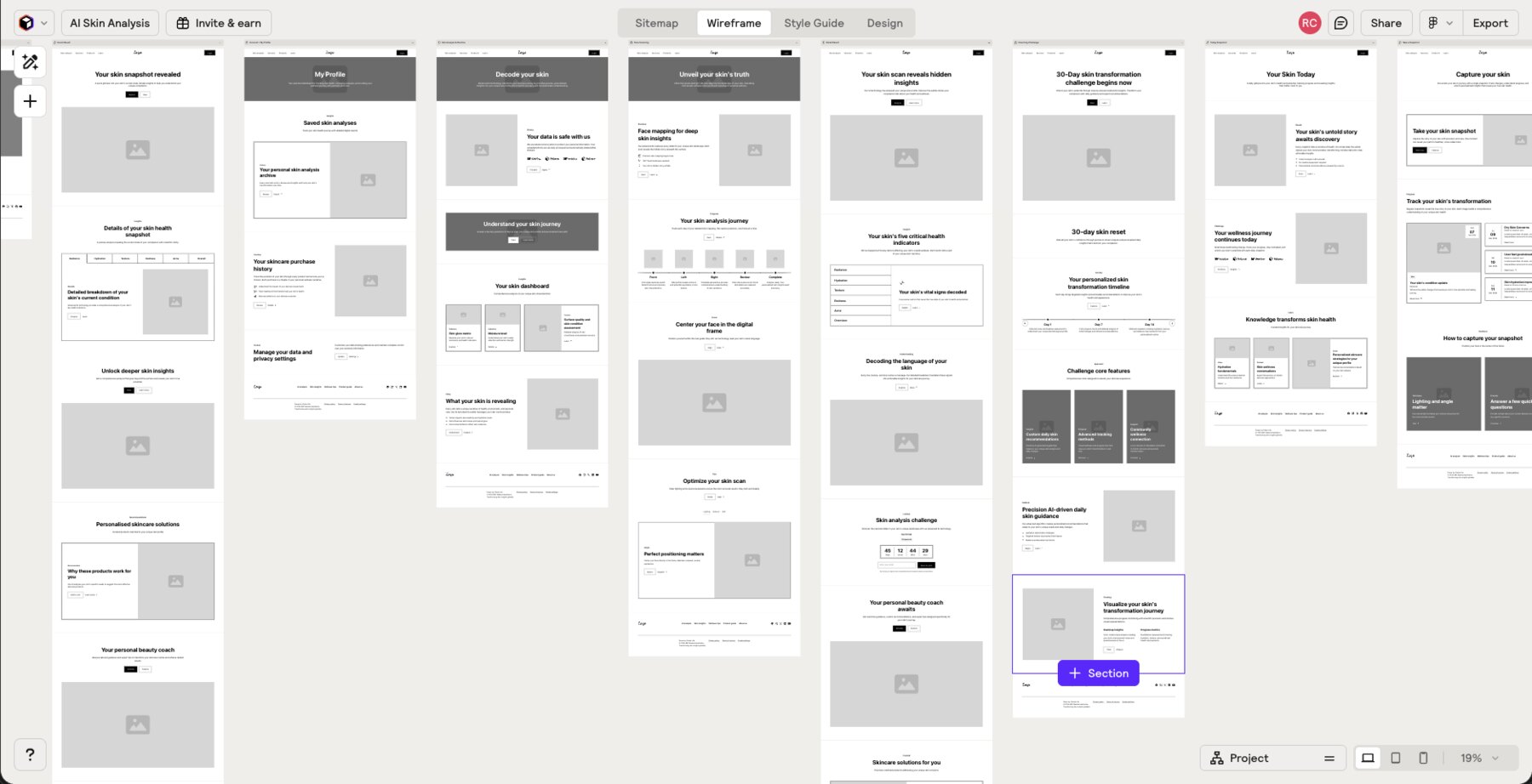
For wireframing I experimented with the AI tool Relume, which helped me generate an initial information architecture and full sitemap. We used it as a foundation to discuss and clarify the entire user flow before committing to detail.
Relume also let me spin up several quick concepts to test brand elements — colour, typography and button detail — gathering feedback early. Once the structure was agreed, I moved into Figma; its Relume integration let me export the wireframes directly and dramatically accelerate the design.
the result
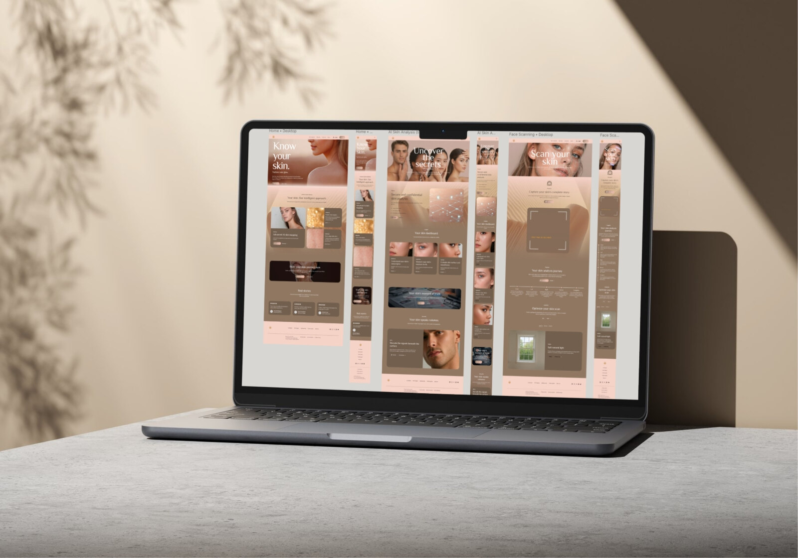
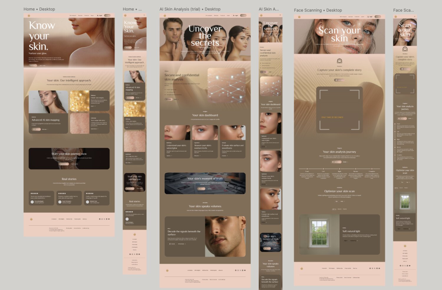
The finished prototype delivers three core journeys — know your skin, AI skin analysis and live face scanning — in one responsive experience that works straight from the browser, on phone or desktop.
the final result
The responsive site brought to life — visitors move from landing to AI skin analysis to their personalised report, all in the browser and delivered investor-ready inside the four-week brief.